
A common requirement we hear from businesspeople kicking off a CRM evaluation is ‘dashboards.’
While business requirements should drive the design of dashboard elements, people often seek dashboard examples for inspiration.
Before diving into specific examples, it’s worth briefly discussing why dashboards are helpful and what their purpose is for a particular business.

CRM dashboards provide users, managers, or administrators with a quick overview of data for a specific job function or department.
Dashboards let you see the state of your business at a glance, turning hours of analysis into minutes of decision-making.
Dashboards are usually created shortly after a new CRM system goes live and reportable data is available. They’re also typically developed based on user and management feedback to ensure their usefulness and relevance. New dashboards can be created as needed, and existing ones can be easily modified.
Not every CRM dashboard component is needed by every employee, and most enterprise CRM solutions are flexible enough to let each user (with appropriate permissions) choose which components to view. Multiple elements can be grouped into predefined sets, enabling a standard sales, service, or marketing dashboard.
CRM Dashboard Example Components
Reviewing specific CRM dashboard examples can provide the inspiration needed to select the right mix of charts, gauges, and lists for your system configuration.
Here are examples of commonly requested dashboard components organized by functional area.
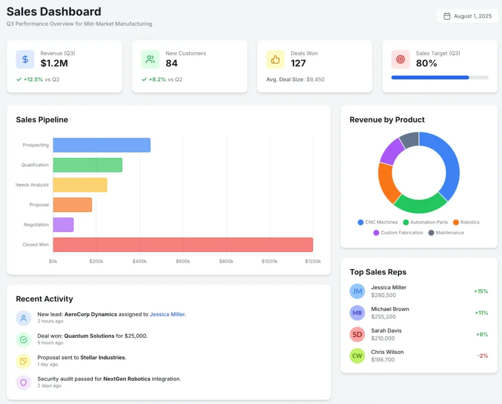
Sales CRM Dashboard Components
A dedicated sales CRM dashboard focuses on pipeline health, revenue forecasts, and activity tracking to help sales leaders and representatives stay aligned on their quotas.
Current Lead Status
A display of various lead status states (open, attempted, contacted, disqualified, etc.) and the total number of leads.
Opportunities By Stage
Shows current opportunities scheduled to close in a given period and the completion stage the opportunity is in, such as Proposal Sent, Contract Review, Final Negotiations, etc.
Sales Forecast vs. Quota
A comparison of projected sales revenue from open opportunities against the team’s or individual’s sales quota for the current period (month, quarter). This is often visualized as a gauge or bar chart showing percentage-to-goal.
Sales Leaderboard
Ranks sales representatives based on key performance indicators (KPIs) such as revenue closed, number of deals won, or activities logged. This helps to foster friendly competition and recognize top performers.
Win/Loss Rate Analysis
Shows the percentage of closed opportunities that were won versus lost. This component can be enhanced by including reasons for lost deals to identify areas for improvement in product, pricing, or sales strategy.
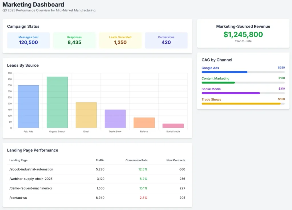
Marketing Dashboard Components
Campaign Status
An overview of campaign performance, including total messages sent, responses received, leads generated, conversions, and more.
Leads By Source
Charts each marketing lead source — paid ads, organic search, email, trade show, etc. — and displays how many leads each source has generated in a given time.
Landing Page Performance
A view of key landing pages, showing traffic, conversion rates (form fills, downloads, etc.), and the number of new contacts generated from each page.
Marketing-Sourced Revenue
Attributes closed-won revenue directly to the marketing campaigns or sources that generated the opportunity. This is a critical component for calculating marketing ROI.
Customer Acquisition Cost (CAC) by Channel
Calculates the total cost to acquire a new customer, broken down by the marketing channel (e.g., Google Ads, Social Media, Content Marketing). This helps in optimizing marketing spend.
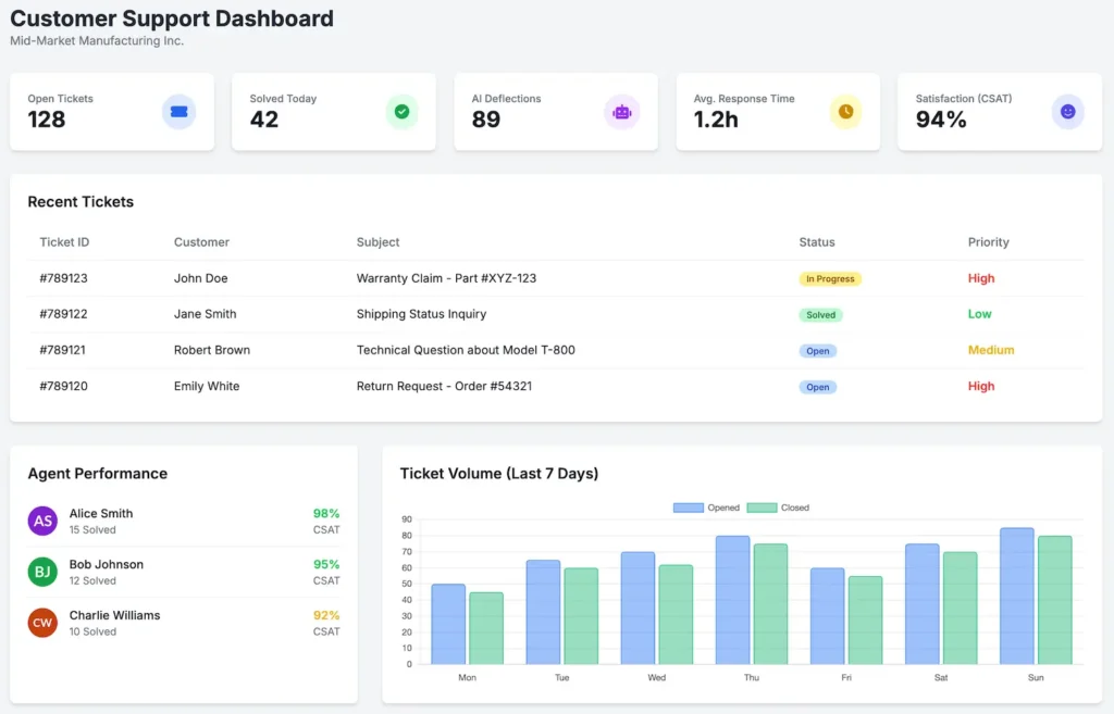
Customer Support Dashboard Components
First Contact Resolution (FCR) Rate
Calculates the percentage of incoming cases that are resolved during the first interaction, without needing follow-up or escalation. A high FCR rate is a strong indicator of efficient support processes and team members.
Age Of Open Cases (Tickets) By Rep
Lists each CSR by name and shows a graph representing the average case age in hours, days, weeks, etc.
Case Status By Rep
Complementing the previous example, this displays various case states (New, Escalated, On Hold, etc.) and their counts, broken down by CSR.
Case Volume by Channel & Type
A chart showing the number of incoming support cases over time, categorized by the channel they came from (email, phone, chat) and the type of issue (e.g., “Billing Inquiry,” “Technical Defect,” “How-To Question”). This is essential for resource planning.
Cases Deflected By AI Agents
This indicates the percentage of cases resolved by AI agents.
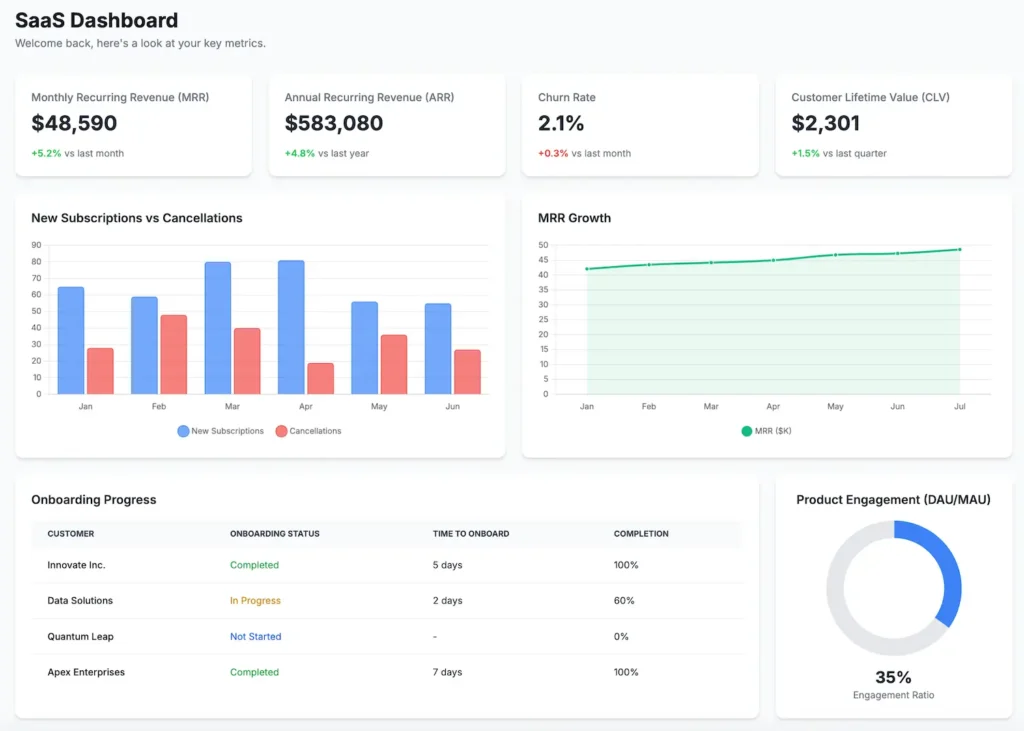
Industry-Specific Dashboards
You may have dashboard requirements that are specific to your industry. For example, a SaaS company might want a view like the following.
Taking Action
Think of each of the components listed above as being similar to the gauges and indicators on your car’s dashboard. They’re all there to provide at-a-glance information that tells users if things are running smoothly or if there’s a problem that might need attention.
Are deals taking too long to close? You may need to work on sales enablement assets and processes.
Is your lead flow too low? It might be time to publish a pillar blog post and content cluster.
Are support cases taking too long to resolve? Maybe it’s time to deploy an AI support agent.
CRM dashboards should be designed to provide actionable insights.
Tip: You can prompt an LLM, such as Google Gemini, or a vibe coding tool like Bolt.new, to generate interactive dashboard mockups.
One Tool Among Many
As with most things in the world of CRM, having useful dashboards depends on understanding your requirements and the types of information you want them to display.
Your business may have unique processes or procedures that would necessitate a custom readout that isn’t in the “standard” component catalog. If so, it’s essential to know this in advance so it can be addressed before it becomes a problem.
Although not every summary and data point can be (nor should be) displayed on a dashboard, they provide users with visibility into overall system health and job-specific performance measurement.
When implemented correctly, even the most basic dashboard components will be helpful.