One of the most common requirements we hear about when speaking to businesses that are beginning, or in the midst of, a CRM evaluation is “dashboards.”
It’s not an unreasonable requirement by any stretch — all major enterprise CRM vendors offer dashboards of some type — but a dashboard in and of itself is not a true requirement. The real requirement is what kind of information a dashboard should display.
I recently came across an issue of Time Magazine that featured an article about the team that was brought in to fix the HealthCare.gov website after its spectacularly abysmal launch at the beginning of October last year.
The piece mentions how, shortly after the team was assembled and arrived in Washington, they visited the government contractors responsible for building the site and getting it live. The part that caught my attention was:
One of the things that shocked Burt and Park’s team most–”among many jaw-dropping aspects of what we found,” as one put it–was that the people running HealthCare.gov had no “dashboard,” no quick way for engineers to measure what was going on at the website, such as how many people were using it, what the response times were for various click-throughs and where traffic was getting tied up. So late into the night of Oct. 18, Burt and the others spent about five hours coding and putting up a dashboard.
As you can imagine, having a real-time display of critical information was a key missing piece of the puzzle for that team to be able to diagnose problems.
After finishing the article, I started to think about the kinds of information we see our clients requesting on their dashboards and how it might be useful to provide some examples for those in the CRM evaluation process.
Information With A Purpose
Before diving into specific examples, It’s worth briefly discussing why dashboards are useful and their purpose in relation to a particular business.
Though the circumstances of their creation are typically far less dire than those of the HealthCare.gov website, CRM dashboards serve the same general purpose: to quickly provide a user, manager, or administrator with a quick overview of data related to a particular job function or department.
Also, unlike the example above, CRM dashboards are usually created shortly after a new system goes live and reportable data is available. They’re also typically developed from user and management feedback to ensure usefulness and relevance. New dashboards can be created as needed, and existing ones can be modified fairly easily.
Finally, not every dashboard component will be needed by every employee, and most enterprise CRM solutions are flexible enough to let each user (if given appropriate permissions) choose which dashboard components they want to see. Multiple components can be grouped together into pre-defined sets, allowing for a standard sales, service, or marketing dashboard.
CRM Dashboard Data Examples
Here are six examples of the information our clients commonly request and use in their CRM dashboards, organized by function.
Sales Dashboards
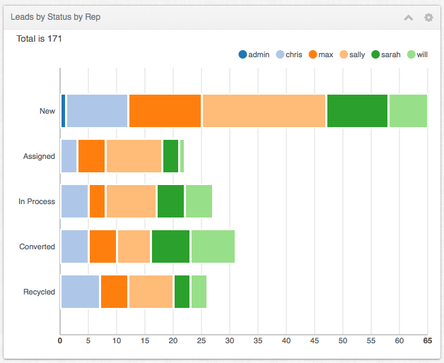
Current Lead Status
A display of various lead status states (open, attempted, contacted, disqualified, etc.) and the total number of leads.
Opportunities By Stage
Shows current opportunities scheduled to close in a given period and the completion stage the opportunity is in, such as Proposal Sent, Contract Review, Final Negotiations, etc.
Marketing Dashboards
Campaign Status
An overview of campaign performance, including total messages sent, responses received, leads generated, conversions, and more.
Leads By Source
Charts each marketing lead source — website, email, trade show, etc. — and displays how many leads each source has generated in a given time.
Customer Support Dashboards
Age Of Open Cases By Rep
Lists each CSR by name and shows a graph representing the average case age in hours, days, weeks, etc.
Case Status By Rep
Complementing the previous example, this displays various case states (New, Escalated, On Hold, etc.) and the number of each, broken down by CSR.
Think of each of the components listed above as being just like the gauges on a car dashboard — speed, RPM, fuel status, mileage — they’re all there to provide at-a-glance information that tells users if things are running smoothly or if there’s a problem that might need attention.
Low on leads? It might be time to publish a new white paper. Average support case taking too long to resolve? Maybe it’s time to hire another CSR. CRM dashboards are intended to provide insight into these kinds of things.
One Tool Among Many
Like most things in the world of CRM, having useful dashboards depends on knowing your requirements and what kinds of information you want your dashboard to display.
Your business may have unique processes or procedures that would necessitate a custom readout that isn’t in the “standard” component catalog, and if so, it’s important to know that beforehand so that it’s addressed before it becomes a problem.
Though not every summary and data point can be (nor should be) displayed on a dashboard, they give users visibility into overall system health and job-specific performance measurement.
When implemented correctly, even the most basic dashboard components will prove useful and help businesses avoid a nightmare scenario like HealthCare.gov.
Whatever may happen to that site in the future, it’s a safe bet that the people running it will know exactly what’s happening at any given time from now on.
