
While running a successful digital marketing campaign is often complex and challenging, its basic premise is quite simple.
Businesses produce and publish useful and valuable content to their target audience, and in each piece of content, there is an inducement to take further action. That inducement is called a ‘call to action’ or CTA.

If you’re not using a CTA on your business’s website, blog posts, newsletters, white papers, and other digital marketing materials, you’re likely missing out on a significant amount of new business.
Anatomy Of A CTA
A good call to action can take many different forms. Using the same CTA across all your digital marketing channels is not a good idea. What works well for a blog post may fail in a monthly newsletter, and vice versa.
A CTA can be as simple as a text link at the bottom of a web page. More commonly, though, CTAs are large, bold graphics that instantly grabbing a viewer’s attention. HubSpot, the company behind one of the leading online marketing automation software platforms, is well known for its bold, clear CTAs. For example:
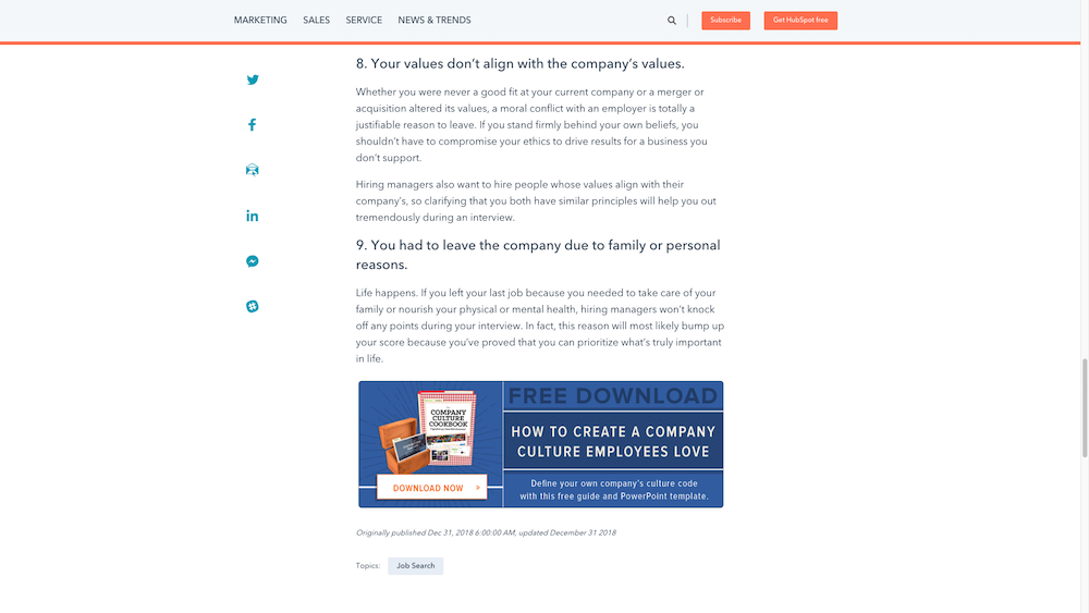
As you can see, their call to action is almost impossible to miss. How successful it is, or any other CTA for that matter, depends on a variety of factors, including:
- How compelling the offer is
- Which stage of the sales funnel is a prospect in
- How receptive or ‘warm’ a prospect is to your brand
- How compelling your CTA is, from a visual standpoint
Creating the perfect blend of the right offer to the right audience at the right time, excitingly and compellingly, is not always easy. Many digital marketers spend years creating, testing, and refining their calls to action to get the best possible results.
Creating a Call To Action
At the end of the day, the best call to action is the one that gets the most visitors clicking on it. What works for your business will be different than what works for another. With that said, there are some generally accepted best practices to remember when creating a good CTA.
1) Make A Compelling Offer
It sounds obvious, but many businesses fail this part of creating a CTA. A compelling offer means that it is timely, relevant, and valuable to your target audience.
For example, a financial services company might post a blog about good investment strategies for people getting tax refunds this year. With that in mind, which of the following would make for a good offer to put in a CTA at the bottom of that blog post:
- “The Ultimate Guide to Investing On Any Budget”
- “Ten Chicken Recipes Every Home Cook Should Know”
No matter how good those chicken recipes might be, that offer is irrelevant to the content on the page and the likely intent of the visitors who are reading it.
2) Be Clear And Concise
Your CTA needs to communicate your offer and convince a viewer to click within a second or two. A paragraph of text is too much for a prospect to process quickly. A sentence or two, at most, is what you should aim for.
Here’s an example from SEO software provider Moz:

“Grow your traffic and draw customers to your business” – clear and concise. It also does a great job of communicating the value of its software, which conveniently leads into our next tip…
3) Communicate Value
Your call to action should also aim to clearly answer this question, “What do I get out of it?” This is the question that every prospective customer will be asking themselves when looking at your CTA.
If the value they’re getting is perceived to be greater than the effort it will take them to acquire it, then you have a positive value proposition.
4) Look Good
A poorly designed CTA can make even the most compelling offer (Free lifetime supply of root beer!) seem less exciting. Your call to action needs to be visually appealing. Graphics will always draw more attention than text, so including both is a common practice.
Including a button is an excellent way of giving visitors a clear place to click to get your offer. It may be hard to believe, but many a CTA goes unclicked simply because there is no bright red (or blue, or green) button that says “Click Here To Get This Thing” included.
5) Don’t Go Overboard
A common mistake those new to digital marketing often make is believing that if one CTA on a page is good, five CTAs is even better. This is not true.
Too many calls to action in one place typically have a detrimental effect. For one, it risks making the content it’s associated with look like a cheap sales pitch. It’s a turn-off for visitors and risks making your brand look bad.
The other problem with including multiple CTAs in the same place is that it dilutes the message of each offer and creates confusion for a visitor. More choices are not better in this case. One clear and prominent message generates the best results.